
Portfolio 2.0: Where Code Meets Cinema 🎬
Portfolio 2.0 isn't just a website—it's an immersive journey through a developer's story. Built with Next.js 15, this portfolio pushes the boundaries of web animation, combining GSAP's precision, Framer Motion's elegance, and Three.js's visual power to create an unforgettable 60fps experience on every device.
The Vision
Traditional portfolios are static résumés. This portfolio is a living narrative that:
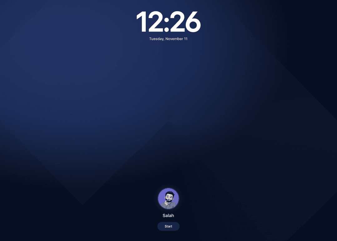
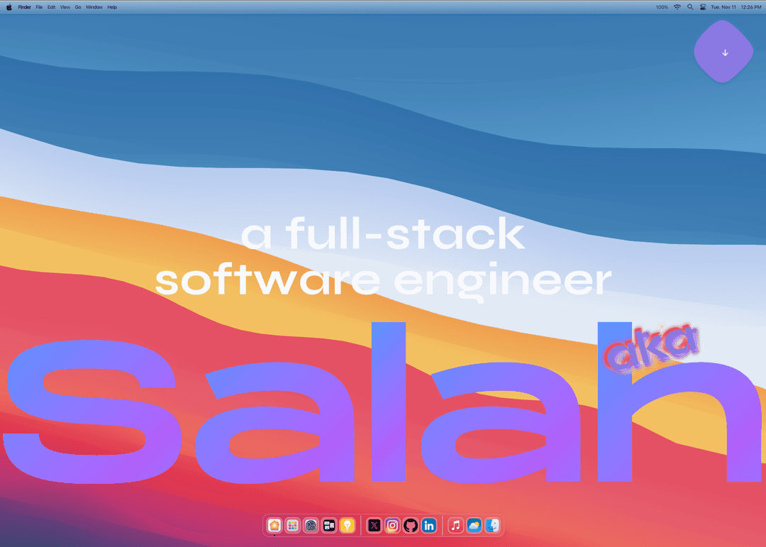
🎭 Captivates instantly with a macOS-inspired lock screen and cinematic hero
📜 Guides through storytelling with parallax scrolling and scroll-triggered reveals
📱 Showcases personality through Instagram-style reels in an iPhone mockup
🎨 Demonstrates mastery with interactive hover effects and 3D elements
♿ Maintains accessibility with reduced motion support and keyboard navigation
⚡ Performs flawlessly with device-adaptive animation strategies (60fps, sub-2s load)
The Challenge
Creating a standout portfolio in 2025 requires solving complex technical problems:
Animation Orchestration – Coordinating GSAP, Framer Motion, and Three.js without conflicts
Mobile Optimization – Touch devices need fundamentally different scroll behaviors
Performance Budget – Heavy assets (3D models, videos) must load progressively
Cross-Browser Consistency – Safari, Chrome, Firefox, iOS, Android all behave differently
State Synchronization – Managing animation states across interconnected sections
This portfolio solves all these challenges while maintaining 60fps animations and sub-2s load times.
The Solution
🔒 macOS-Inspired Lock Screen
The experience begins with a cinematic lock screen featuring animated gradients, real-time clock, progress bar loader, and blur-and-scale exit animation.
// Animated gradient background
useEffect(() => {
  gsap.to(bgRef.current, {
    backgroundPosition: '60% 30%, 40% 80%',
    duration: 10,
    ease: 'sine.inOut',
    repeat: -1,
    yoyo: true,
  })
}, [])

// Loading with requestAnimationFrame
const step = () => {
  const elapsed = Date.now() - startTime
  const next = Math.min((elapsed / 2000) * 100, 100)
  setProgress(next)
  if (next < 100) {
    raf.id = requestAnimationFrame(step)
  } else {
    setIsLoading(false)
    setShowStart(true)
  }
}
Using requestAnimationFrame instead of setInterval
ensures smooth 60fps progress updates.
🌊 Hero with Fluid Typography
The hero features self-adjusting text that maximizes viewport usage with dynamic font sizing algorithm, gradient text effects, and animated wave underlines.
// Dynamic font sizing for perfect fit
const resizeFont = () => {
  const parent = muhammad.parentElement
  if (!parent) return
  let fontSize = 10
  muhammad.style.fontSize = `${fontSize}px`

  while (muhammad.scrollWidth <= parent.clientWidth - 40 && fontSize < 500) {
    fontSize += 1
    muhammad.style.fontSize = `${fontSize}px`
  }

  muhammad.style.fontSize = `${fontSize - 1}px`
}
📜 Hybrid Horizontal Scroll
The "About Me" section demonstrates device-adaptive animation:
Desktop: GSAP ScrollTrigger with smooth horizontal scroll
Mobile: Framer Motion for native touch scrolling (no browser chrome conflicts)
// Touch detection
useEffect(() => {
  const checkTouch = () => {
    setIsTouchDevice(
      'ontouchstart' in window ||
        navigator.maxTouchPoints > 0 ||
        navigator.msMaxTouchPoints > 0
    )
  }
  checkTouch()
}, [])

// GSAP for desktop
useGSAP(() => {
  if (isTouchDevice || !textRef.current) return

  gsap.to(textRef.current, {
    x: -(textRef.current.scrollWidth - window.innerWidth),
    ease: 'none',
    scrollTrigger: {
      trigger: containerRef.current,
      start: 'top bottom',
      end: 'bottom top',
      scrub: true,
      invalidateOnRefresh: true,
    },
  })
}, [isTouchDevice])

// Framer Motion for mobile
const { scrollYProgress } = useScroll({
  target: containerRef,
  offset: ['start end', 'end start'],
})
const x = useTransform(scrollYProgress, [0, 1], ['0%', '-50%'])
This hybrid approach eliminates mobile browser chrome conflicts. When the address bar hides/shows, GSAP ScrollTrigger gets confused. Framer Motion's useScroll works with native scroll events, avoiding this entirely.
🎨 Interactive Intro with Hover Reveals
The introduction features elastic image reveals on hover with GSAP SplitText for word-by-word color transitions, multiple images positioned around hovered text, and elastic bounce animations.
// Hover animation with elastic bounce
useEffect(() => {
  const boxes = boxRefs.current.filter(Boolean)
  if (boxes.length === 0) return

  if (isActive) {
    gsap.fromTo(
      boxes,
      { scale: 0, opacity: 0, y: 50 },
      {
        scale: 1,
        opacity: 1,
        y: 0,
        duration: 0.8,
        ease: 'elastic.out(1, 0.5)',
        stagger: 0.1,
      }
    )
  }
}, [isActive])
🚀 Journey Section with Scroll Progress
A Framer Motion-powered section revealing content progressively with section zoom and rotate, emoji character animations, and scramble text effects.
📱 Instagram-Style Hobby Reels
An iPhone mockup showcasing personal interests with realistic iPhone frame, auto-playing video reels, tap left/right navigation, and animated text overlays.
🎯 Thanking Section with Pinned Scroll
A scroll-pinned section with layered animations including section pinning, background opacity fade-in, text entrance with 3D rotation, horizontal drift, and character-by-character reveal.
🎭 macOS-Inspired Dock
A fully functional dock with physics-based magnification using PNG icons, hover magnification with Framer Motion springs, and command center with keyboard shortcuts (⌘K).
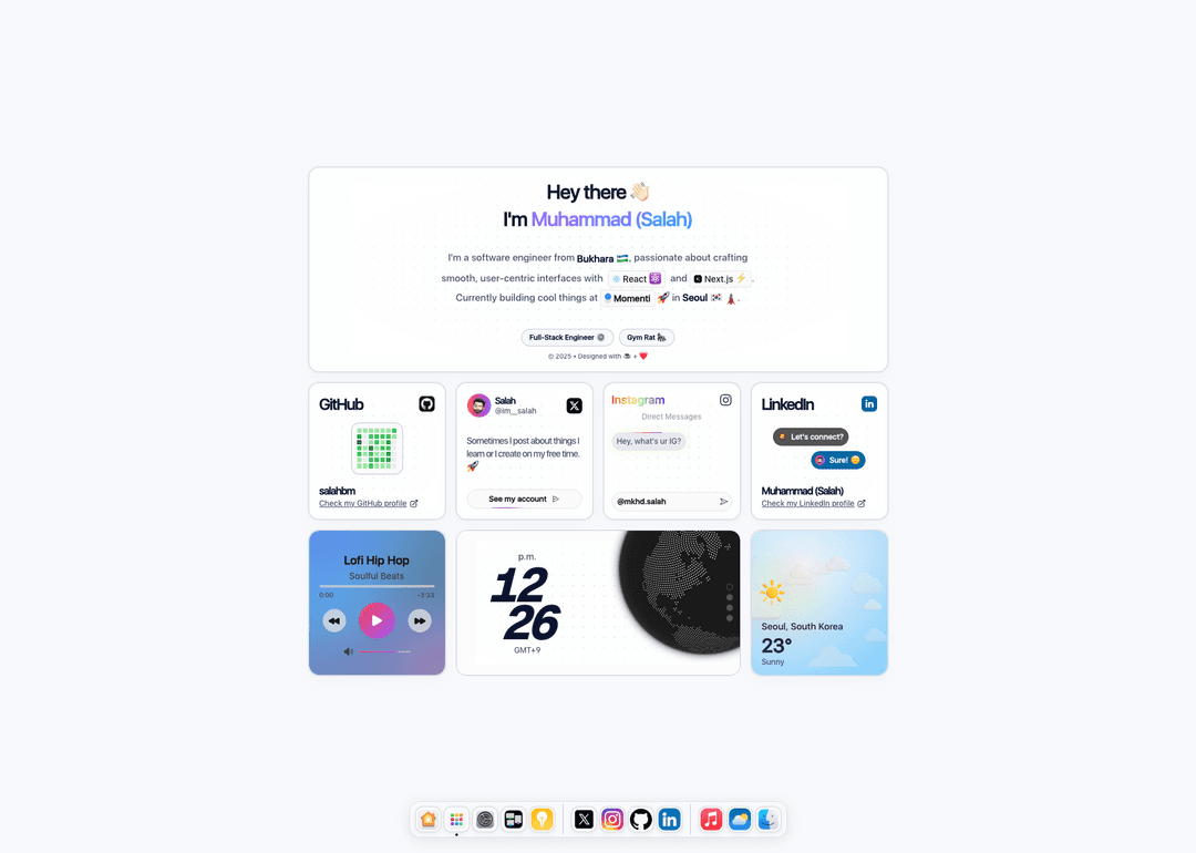
🎨 Dashboard with Bento Grid
A widget-based dashboard featuring Smart Stack with swipeable cards, GitHub stats via Octokit GraphQL, social media cards, music player, and weather widget.
Technical Architecture
The Modern Stack
| Layer | Technologies | | --------------- | -------------------------------------------------------------- | | Framework | Next.js 15 (App Router), React 19 | | Language | TypeScript, MDX | | Styling | Tailwind CSS, Shadcn/ui, Radix Primitives | | Animation | GSAP (ScrollTrigger, SplitText, ScrollSmoother), Framer Motion | | 3D Graphics | Three.js, React Three Fiber, @react-three/drei, Cobe | | State | Zustand | | Data | next-mdx-remote, Octokit GraphQL | | Build | Turbopack, ESLint, Prettier | | Analytics | Vercel Analytics, Speed Insights |
Animation Architecture
The portfolio uses a hybrid animation strategy:
// Device detection
const isMobile =
  /iPhone|iPad|iPod|Android/i.test(navigator.userAgent) ||
  'ontouchstart' in window

// ScrollTrigger configuration
ScrollTrigger.config({
  autoRefreshEvents: 'visibilitychange,DOMContentLoaded,load',
  ignoreMobileResize: true,
})

// ScrollSmoother only on desktop
if (!isMobile) {
  ScrollSmoother.create({
    smooth: 1.3,
    effects: true,
    normalizeScroll: false,
  })
}

// Cleanup on unmount
return () => {
  ScrollTrigger.getAll().forEach((trigger) => trigger.kill())
  ScrollSmoother.get()?.kill()
}
Key Principles:
- GSAP for precision – Timeline-based animations, scroll triggers, morphing
- Framer Motion for React – Component animations, gestures, springs
- Device detection – Different strategies for touch vs. non-touch
- Cleanup on unmount – Prevent memory leaks
- Performance monitoring – 60fps target with
will-change
Mobile Optimization
Mobile devices receive optimized parameters:
// Reduced scroll distances
const pinEnd = isMobile ? '+=100%' : '+=200%'
const textEnd = isMobile ? '+=60%' : '+=100%'

// Faster scrub values
const scrubValue = isMobile ? 0.5 : 1

// Reduced horizontal movement
const driftAmount = isMobile ? '30%' : '60%'
CSS for smooth native scrolling:
body {
  -webkit-overflow-scrolling: touch;
  overscroll-behavior-y: none;
  touch-action: pan-y;
  -webkit-tap-highlight-color: transparent;
}
Mobile optimization isn't just reducing values—it's understanding that touch scrolling is fundamentally different. ScrollSmoother conflicts with native touch events, so we disable it entirely on mobile.
Provider Architecture
Global functionality through providers:
<ThemeProvider attribute='class' defaultTheme='light'>
  <TooltipProvider>
    <LockScreenProvider>
      {children}
      <PageTransition />
      <CursorStyleInjector />
      <GlobalKeyboardShortcuts />
      <MusicPlayerInitializer />
      <Toaster />
      <MagnifyingGlass />
    </LockScreenProvider>
  </TooltipProvider>
</ThemeProvider>
Performance Optimizations
1. Progressive Loading
const GlobeView = useMemo(
  () => dynamic(() => import('./globe-comp'), { ssr: false }),
  []
)
2. Image Optimization
<Image
  src='/medias/images/avatar.webp'
  alt='Salah'
  fill
  sizes='(min-width: 1024px) 280px, (min-width: 768px) 240px, 200px'
  priority
  quality={90}
/>
3. Animation Cleanup
useEffect(() => {
  const ctx = gsap.context(() => {
    // All GSAP animations here
  }, containerRef)

  return () => ctx.revert()
}, [])
4. Reduced Motion Support
const prefersReducedMotion = window.matchMedia(
  '(prefers-reduced-motion: reduce)'
).matches

if (!prefersReducedMotion) {
  // Enable animations
}
Impact & Learnings
What This Project Delivers
✅ Memorable first impression – Lock screen and hero capture attention immediately
✅ Smooth on all devices – Hybrid animation strategy prevents mobile conflicts
✅ Accessible by default – Keyboard navigation, reduced motion, semantic HTML
✅ Lightning fast – Sub-2s load time with progressive enhancement
✅ SEO optimized – Server-side rendering, metadata, sitemap
✅ Developer-friendly – Clean architecture, TypeScript, comprehensive comments
Technical Achievements
- Hybrid animation system – GSAP + Framer Motion working in harmony
- Device-adaptive scrolling – Different strategies for touch vs. mouse
- Zero layout shift – Suspense boundaries and skeleton states
- 60fps animations – Optimized with
will-changeand GPU acceleration - Progressive enhancement – Core content works without JavaScript
- Type safety – End-to-end TypeScript with strict mode
Architecture Lessons
Animation libraries can coexist – Use GSAP for timelines, Framer Motion for React components
Mobile needs special care – Touch scrolling conflicts with custom scroll behaviors
Cleanup is critical – Always dispose GSAP instances and event listeners
Performance budgets matter – Monitor bundle size and animation frame rates
Accessibility isn't optional – Reduced motion and keyboard nav are requirements
Progressive loading wins – Heavy assets should load after critical content
Key Patterns
1. Conditional Animation Strategy
const isTouchDevice = 'ontouchstart' in window

if (isTouchDevice) {
  // Use Framer Motion with native scroll
} else {
  // Use GSAP with ScrollSmoother
}
2. GSAP Context Pattern
useEffect(() => {
  const ctx = gsap.context(() => {
    // All animations scoped to this context
  }, containerRef)

  return () => ctx.revert()
}, [])
3. Device-Specific Parameters
const config = {
  pinEnd: isMobile ? '+=100%' : '+=200%',
  scrub: isMobile ? 0.5 : 1,
  drift: isMobile ? '30%' : '60%',
}
Showcase
Deployment
Build Configuration:
# Development with HTTPS
yarn dev

# Production build
yarn build

# Start production server
yarn start
Environment Variables:
GITHUB_TOKEN=your_token
VERCEL_ANALYTICS_ID=your_id
Hosting: Vercel with automatic deployments from GitHub
Live Site: salah.uz
Source Code: GitHub
Built with ❤️ using Next.js 15, GSAP, Framer Motion, and Three.js